Please feed our starving team! 😭
Our mission: To provide marketers with free content while we avoid getting real jobs.
Your impact: Your support funds our kombucha tap and vegan snacks
The honest truth: Without your donation, we might have to face the prospect of putting up a paywall like every other content site on earth.
Donate now because Mark Zuckerberg isn’t returning our calls about investing in our business model and we’ve already maxed out our crappy bank’s credit limit.
But hey, don’t just donate 10 bucks! That barely covers the tiger nut milk demanded by our cat.
😉
THE WORLD’S TOP 10 MARKET RESEARCH DIAGRAMS
The world’s top 10 market research diagrams. The top 10 most used consumer research diagrams, illustrations and charts.
Brought to you by Mau, a Senior Digital Marketing Specialist at eDigital.
Popular this month: Marketing to youth in Australia – top tips guide
THE WORLD’S TOP 10 MARKET RESEARCH DIAGRAMS
Understanding consumer behaviour is pivotal for effective marketing planning, therefore these top 10 diagrams are widely used in consumer research or consumer behaviour analysis for marketing planning assisting marketers understand and visualise consumers’ decision-making processes, motivations, preferences, and journeys to inform successful marketing strategies.
These most used diagrams for market research visualise concepts, data, patterns, or processes critical to decoding consumer behaviour and shaping effective marketing plans.
These popular top 10 consumer research diagrams are based on trends in marketing tools, consumer research methodologies, and industry practices.
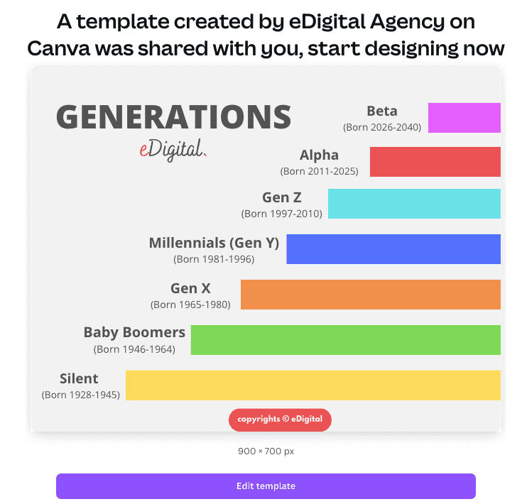
10. Generation Names & Years Diagrams
The generation years and names you are about to find in the chart below refer to Western social generations defined as a birth demographic cohort (in social science) of all of the people born during a specific period of time.
Generation names are those arbitrary labels we’ve slapped onto groups of humans based on when they tumbled onto this planet.
Knowing all the gen names and years and showing this chart to people who do not believe you is absolutely essential to your survival, right up there with oxygen and not walking into traffic.
Understanding whether someone is of a specific generation allows you to do what humans do best: make sweeping generalisations about massive groups of people without the inconvenience of getting to know them as individuals!
You can buy this Generations & Born Years chart – template ready on Canva and create your own version now!
Get this premium chart now, edit it as you wish and make your own design on Canva.com
How to access this Gen names and years diagram:
Steps:
- Complete payment on Paypal.
- Once payment is completed, you will be shown a “Return to merchant” link. Please click on that link to access this premium template.
- Any questions, you can always contact us.
Generation names and years included on this popular diagram
- Lost generation (1883-1900)
- Greatest generation (1901- 1927)
- Silent generation (Born 1928-1945)
- Baby Boomers (Born 1946-1964)
- Gen X (Born 1965-80)
- Millennials – also known as Gen Y (Born 1981-1996)
- Gen Z (Born 1997-2010) Related read: The top 10 Gen Z characteristics
- Alpha (Born 2011-2025) So, what is after Gen Alpha?
- Beta (Born 2026-2040)
You can also use this cool new different Generation Names chart designed by Mau at eDigital.
9. Customer Journey Maps
The famous Customer Journey Map is one of the world’s top 10 most popular market research diagrams.
The Customer Journey Map is a customer-centric graph focused on the customer experience generally presented horizontal, showing progression over time.
The Customer Journey Map explores the detailed emotional and practical experience from the customer’s viewpoint, tracks a consumer’s experience across touch all points (awareness, consideration, purchase) including post-purchase (retention).
It reveals pain points and identify where potential customers drop off.
The Customer Journey Map often includes emotions, pain points, touch points, and customer thoughts in order to understand and improve customer experience.
Proper analysis of the Customer Journey Map should indicate opportunities to tailor marketing strategies for better engagement.
The customer Journey Map is a visual representations of the entire customer experience that can include not only touch points but also emotions, and decision factors at each stage.
This popular diagram is also called:
- Consumer Decision-Making Process
- Customer Journey Stages
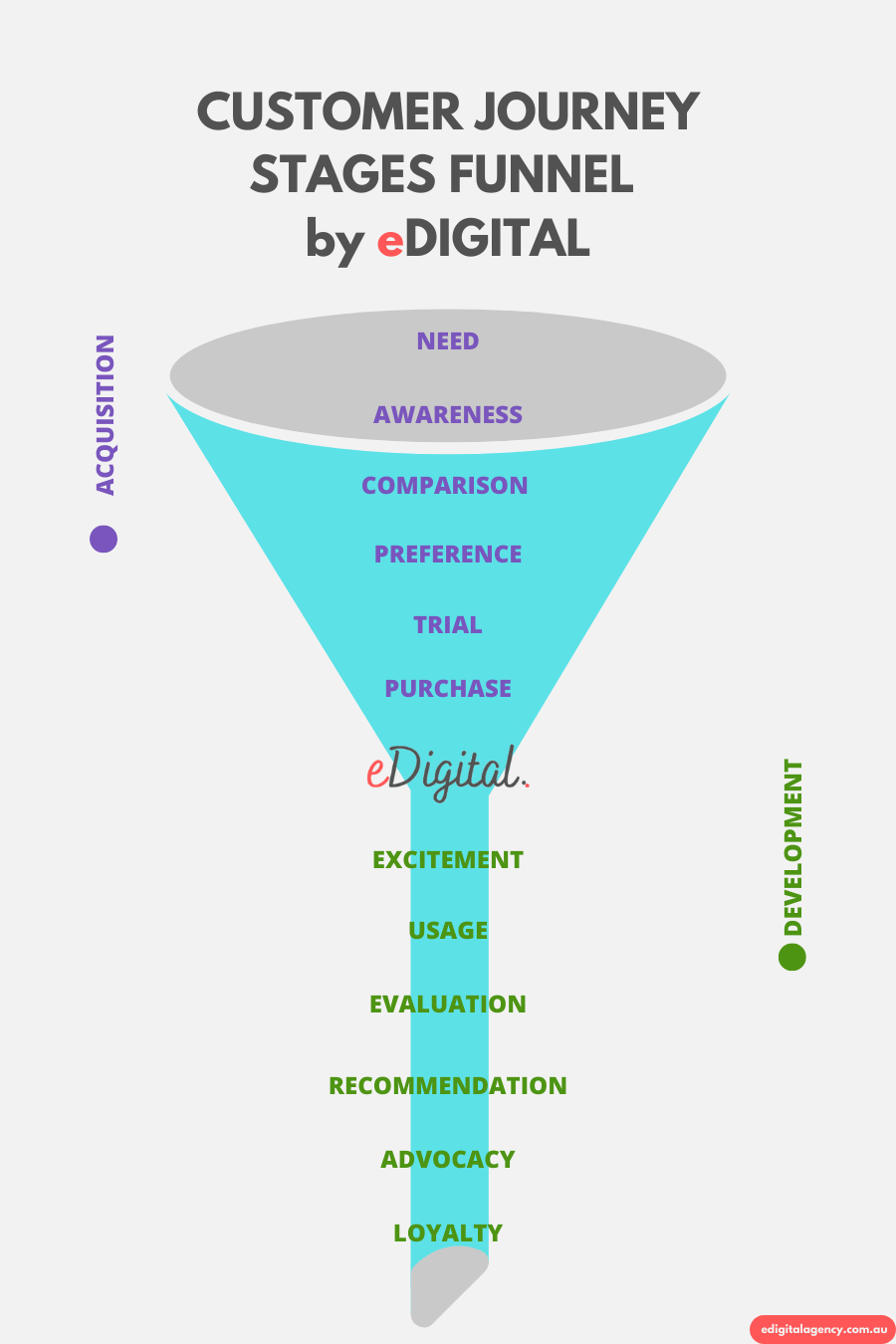
customer journey stages funnel diagram chart framework
⭐️ You will also like: Marketing to Australia’s youth
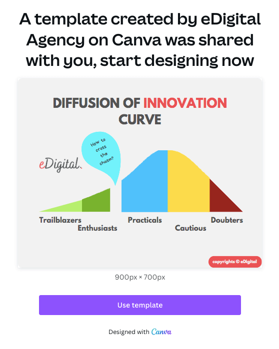
8. Diffusion of Innovation Curve Diagrams
The Diffusion of Innovation Curve is a bell-shaped curve illustrates how new products or ideas spread through a population over time, categorising adopters into groups like innovators, early adopters, early majority, late majority, and laggards.
Marketers use this to understand adoption rates and tailor strategies for different stages.
You can buy this diffussion of Innovation Curve – template ready on Canva and create your own version now!
Buy this premium “Diffusion of Innovation” Curve template and edit it as you wish
How to access this Diffusion of Innovation Curve diagram:
Steps:
- Complete payment on Paypal.
- Once payment is completed, you will be shown a “Return to merchant” link. Please click on that link to access this premium template.
- Any questions, you can always contact us
7. Perceptual Map Diagrams
A perceptual Map Diagram plots brands or products based on consumer perceptions (e.g., price vs. quality). Highlights competitive positioning to refine branding and messaging strategies.
Perceptual Map Diagrams in market research are two-dimensional plots showing how consumers perceive brands relative to competitors across key attributes (e.g., price vs. quality).
The Perceptual Map is also called: Brand Positioning Map.
Marketers are also reading: Gen Alpha years
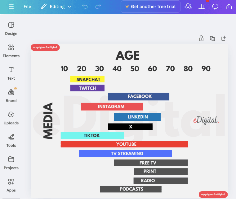
6. Social Media Channels by Age Diagrams
The Social Media Channels by Age Diagram provides a great indication of the social media user’s ages per platform including TikTok, Instagram, Twitter, Youtube, Facebook, Snapchat, Twitch and Linkedin.
You can buy this Social Media usage by Age graph – template ready on Canva and create your own version now!
How to access this Social Media Usage by Age graph template:
Steps:
- Complete payment on Paypal.
- Once payment is completed, you will be shown a “Return to merchant” link. Please click on that link to access this premium template.
- Any questions, you can always contact us
Marketers are using the best social media strategy plan template
5. Empathy Map Diagrams
An Empathy Map Diagram captures what consumers think, feel, say, and do to understand their emotional drivers. Uncovers motivations and barriers, informing emotionally resonant marketing tactics.
An Empathy Map Diagram is a quadrant diagram capturing what customers think, feel, say, and do regarding products or services, helping brands develop deeper consumer understanding.
Marketers also read: What is after Gen Z?
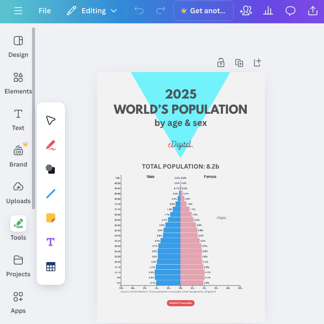
4. World’s Population Pyramid Graph
The World’s Population Pyramid Graph shows the age and gender distribution of the world’s population assisting marketers tailor their offerings to match the population’s life stage.
You can buy this World’s Population Pyramid Graph – template ready on Canva and create your own version now!
world population pyramid graph template
Marketers also checked out this year’s top 10 TikTok Marketing trends
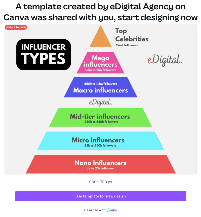
3. Influencer Types Pyramid Diagrams
Influencer Types Pyramid Diagrams are valuable planning tools for marketers because they organise influencers hierarchically based on reach, engagement or other key metrics.
Influencer Types Pyramid graphs are particularly useful for campaign planning as they visually represents how different influencer tiers reach varying audience sizes, helping marketers align their goals with appropriate influencer types.
You can buy this Influencer Types Pyramid – template ready on Canva and create your own version now!
Access this Influencer Types Tiers Levels Pyramid Graph Template now!
⚡️ Trending this week: this year’s top 10 social media marketing trends
2. Marketing Funnel Diagrams
Marketing Funnel Diagrams show how companies attract and nurture potential customers from a business perspective, helping marketers optimise conversion rates and marketing efficiency.
Marketing Funnel Graphs are business-centric and are focused on conversion. Generally this chart is vertical (narrowing from top to bottom) and visually represents conversion stages, primarily focused on the path to purchase, however in some cases includes retention states.
The Marketing Funnel sometimes is also called:
- Customer Purchase Funnel. focuses more specifically on how customers make buying decisions generally visualised as a vertical, narrowing funnel.
In practice, these two Funnels often overlap significantly, with the marketing funnel generally beginning earlier in the relationship and the Customer Purchase Funnel being more concentrated on the decision and transaction phases.
1. Consumer Decision Tree
A Consumer Decision Tree is a hierarchical diagram showing the sequence of decision criteria consumers use when selecting products in a category (e.g., first price, then flavor, then packaging).
OTHER POPULAR DIAGRAMS IN CONSUMER RESEARCH
The below are other popular diagrams that help marketers understand consumers and informing marketing strategies. Marketers frequently adapt and customise these diagrams for their specific needs, leading to a wide variety of visual representations.
- Affinity Diagram: Groups consumer feedback or survey data into themes (e.g., needs, frustrations). Synthesises qualitative research to prioritise consumer-focused strategies.
- AIDA Model Diagram: Outlines the steps of consumer engagement: Attention, Interest, Desire, and Action, guiding the creation of compelling marketing messages.
- Attribution Models: Can include diagrams illustrating the different touch points a consumer interacts with before a conversion and how credit for the conversion is assigned to each touchpoint (e.g., first-click, last-click, linear, time-decay). While often more technical, simplified visual representations are crucial for understanding marketing channel effectiveness.
- Behavioural Influence Map: Shows the various factors (social, cultural, personal, psychological) influencing consumer purchase decisions.
- Black Box Model of Consumer Behaviour: Focuses on the internal and external factors influencing consumer decisions, emphasising the ‘black box’ of the consumer’s mind.
- Conversation Prism 5.0. Shows all the digital platforms people use to communicate, from mega-players to niche communities. The Prism helps marketers focus their efforts on where their actual audience is hanging out.
- Customer Persona Diagrams. Visualises detailed profiles of target consumer segments (demographics, behaviours, goals). Guides personalised campaign planning by aligning messaging with specific audience needs. This popular diagram represents key segments of a brand’s audience, detailing demographics, behaviours, motivations, and goals to inform targeted marketing strategies. While not a single standardised diagram, the visual representation of a target customer profile – including demographics, psychographics, motivations, pain points, and buying behaviors – is a foundational tool. Various templates and visual formats exist for creating and presenting buyer personas. The Customer Persona Diagram is also called The Buying Persona Template.
- Engel-Kollat-Blackwell (EKB) Model: A comprehensive model detailing the decision-making process, incorporating information processing, environmental influences, and individual differences.
- Elaboration Likelihood Model (ELM): This model illustrates two routes to persuasion: the central route (based on thoughtful consideration of information) and the peripheral route (based on heuristics and superficial cues). Marketers use this to determine the most effective message strategies based on consumer involvement.
- Fishbone diagram (Ishikawa): Analyses root causes of consumer behaviour issues (e.g., low brand loyalty). Pinpoints factors like pricing or experience affecting consumer decisions, aiding strategy.
- Heat Maps: Visual representations of user attention and interaction data from websites, packaging, or advertisements using color intensity to show engagement.
- Hero’s Journey. The hero’s journey is a metaphor for personal growth, self-discovery, and the human vs odds victory. By aligning your brand story with this powerful narrative structure, your brand can focus 100% on your customers, identifying with their struggles and making them the hero of your story.
- Mind Maps: Organises insights from consumer research (e.g., preferences, trends) for brainstorming campaigns. Structures complex qualitative data to spark creative marketing ideas.
- Market Segmentation Diagram. Visual representations of how a broad consumer market is divided into smaller, more homogeneous groups based on characteristics like demographics, psychographics, behaviour and geography. Various visual formats (e.g., Venn diagrams, matrices) illustrate different segmentation approaches.
- Maslow’s Hierarchy of Needs Pyramid: A pyramid illustrating human needs from basic (physiological) to advanced (self-actualisation), used to understand consumer motivations.
- Segmentation, Targeting, and Positioning (STP) Model. Breaks down the process of dividing a market into segments, targeting specific segments, and positioning products to appeal to those segments.
- SWOT Analysis Diagrams. Assess strengths, weaknesses, opportunities, and threats related to consumer perceptions or market trends. Help align marketing plans with consumer-driven opportunities and challenges.
- Technology Adoption Curve – Bell curve showing different consumer segments based on how quickly they adopt new products (innovators, early adopters, early majority, late majority, laggards).
- Theory of Reasoned Action (TRA) and Theory of Planned Behaviour (TPB): These models diagram the factors influencing consumer intentions and behaviours, including attitudes, subjective norms (social influence), and perceived behavioural control (TPB). Marketers use these to identify levers for influencing consumer choices.
- Value Proposition Canvas: Structured framework connecting customer needs and pain points with product features and benefits.
These diagrams serve as essential tools for marketers to dissect and comprehend consumer behaviours, enabling the development of more effective marketing strategies.
Conclusion
These top 10 popular diagrams are selected for their prevalence in consumer research and consumer behaviour analysis.
These diagrams help marketers visualise complex consumer data, identify opportunities, and develop strategies that align with actual consumer behaviour patterns rather than assumptions.
For instance, customer journey maps and personas are foundational for translating research into actionable strategies.
Consumer research emphasises qualitative and quantitative insights (e.g., surveys, interviews), making diagrams like empathy maps and affinity diagrams critical for synthesis.
Behaviour analysis diagrams focuses on decision-making, where consumer journey maps and funnels shine.
Marketing planning ties these insights to campaigns, so diagrams like perceptual maps and SWOT analysis help position brands effectively.
There is no global ranking of the most used diagrams for consumer research, so I prioritised utility and adoption based on marketing frameworks.
Final note: Are your marketing costs through the roof?
If your customer acquisition costs are climbing faster than a startup founder’s ego (after a successful IPO), and you’re hooked on paid ads like a reality TV star drama or a Tinder date who keeps accepting your dinner invites but never calls you back.
If that sounds like your situation, you should contact us.
Our exclusive digital marketing strategy workshops will mercilessly dissect your marketing, expose all the weak spots, and show you how to ditch the social media algorithms chokehold and build a marketing engine you actually own.
We’ll shake up your team’s thinking, drop fresh ideas and turn your marketing from “meh” to money-making.
Ready to stop burning cash and start making it? Hit us up! We offer:
🔥 Digital Marketing Strategy. Because hope is not a plan.
🔥 Online Ads (Google, Social, Remarketing). The art of spending money wisely for once.
🔥 Social Media Marketing Training. So you stop posting into the void.
🔥 SEO Strategy & Execution. Because if Google doesn’t know you exist, do you even?
🔥 Influencer & Celebrity Marketing.Get people with clout to talk about you.
🔥 Branding & Logo Design. So you don’t look like a dodgy side hustle.
🔥 Consumer Giveaways & Competitions. Because people will do anything for free stuff.
🔥 Email Marketing & Drip Sequences. Slide into inboxes the right way.
🔥 Conversion Rate Optimisation. Turn window shoppers into actual buyers.
Ready to start marketing like a boss? let’s talk. 🚀
THE BEST GENERATION YEARS CHART & NAMES
was brought to you by Mau

Considered one of the best marketing consultants in Sydney (and not just by Mau’s mom), Mau delivers killer digital marketing strategy workshops and best social media training so good, even your grandpa will get it.
5k+ smart marketers who love stealing good ideas receive Mau’s weekly email, while others tired of guessing use Mau’s Digital Marketing Plan and Social Media Plan templates.
Mau is travelling the 🌎 ✈️ probably posting questionable travel choices on TikTok or YouTube