Support Our Free Publishing Platform!
Our mission: Provide marketers with a free space to learn and grow without subscriptions or hefty fees. We rely on community support to keep it that way.
Your impact: Your support fund the tools and team that keep this website thriving.
Join us: Donate today to keep this website free 🙂
POOR 17 E-NEWSLETTER EXAMPLES THAT WENT BAD
The worst email marketing examples that went bad. Hard to read poor eNewsletters, boring emails, email formatting issues or not optimised images when sending marketing or sales emails.
Brought to you by Mau, a Senior Email Marketer at eDigital.
POOR 17 E-NEWSLETTER EXAMPLES THAT WENT BAD
Email marketing is one of the most personal and highly effective channels to bring traffic, repeat purchases and new leads to your business. Invest in professional email marketing software, design and copywriting and/or content creators and make it a great investment for your business and your clients.
Below are some poor email marketing examples that went bad…
You will enjoy watching: this year’s top 10 graphic design trends
GOOGLE LOCAL GUIDES PIXEL 5 – OFFER IS MISSING
With some magic, Google disappears the offer from their email copy 🙂 Local guides will have to go through all the processes in the shopping cart to realise the offer was $99 off.
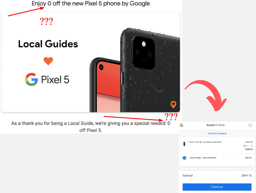
Google Local Guides offer missing copy bad email marketing example
Popular today: this year’s top 10 social media marketing trends
Marketers are learning how to deliver customer service with the best customer service plan
NEIGHBOURLYTICS EMAIL – WILL YOU READ IT?
Subject line: It’s 2020. Our newsletter begins, and we wish it was under better circumstances.
The subject line and body text are quite bland.
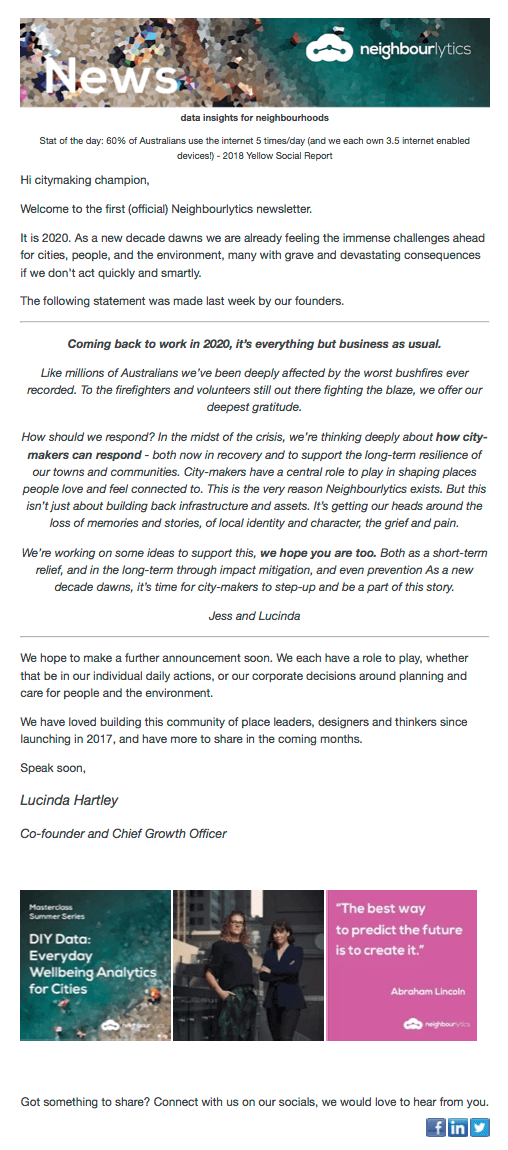
poor email marketing example bad design worst neighbourlytics
Exclusive: the world’s top 25 most-followed sports athletes on Instagram
FLICKR PRO CEO PITCH EMAIL DECEMBER 2019
This email pitch by Flickr CEO Don MacAskill does not offer any value to its members. It focuses on bland “about me” reasons for people to support the photography platform. Had this been passed to a copywriter or marketer surely the message would have been a different one? A message that inspires people or at least gives them key reasons to pay for their pro version.
Really poor execution. Customers do not care what you have done and customers do not bother to know what you are not. If a platform is not getting momentum is because it has failed to offer true value. Full point.

Flickr Pro version pitch CEO email December 2019
If people are not paying for your pro version they are not seeing the value.
Mau
Marketers are using some o the top 25 trending hashtags on TikTok
GOOGLE AUSTRALIA
The email header presents Samsung, however, the copy introduces Suncorp. Upps! Someone fell slept while sending this out!
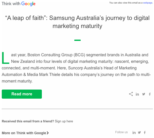
think with google – email marketing mistakes that go bad
Just in: The best time to post on TikTok
TUMBLR INVITE TO VOTE FOR AWARDS EMAIL
Have you ever wondered how your email looks when a recipient forwards it to a friend? This might happen…
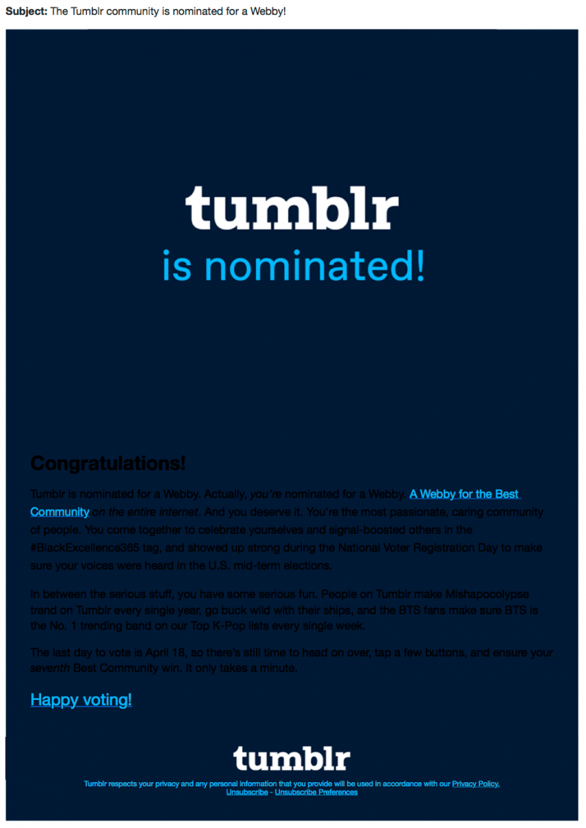
Invite to vote for award bad formatted email went wrong Tumblr
Marketers checked out some of the top 25 most followed Australians on Youtube
WILDLIFE CONSERVATION FILM FESTIVAL ENEWSLETTER
What went bad:
- Too much text. People do not read, they scan for key information.
- Also, image sizes are not optimised and text overlays on images are not readable.

Wildlife Conservation Film Festival Newsletter March 2019
Not sure what to sell? This year’s top 10 fastest-growing industries list
MEDIAMATH ENEWSLETTER
The guys behind “The Guide to Getting Attribution Right” seem they need to read first “The Guide for Getting Email Marketing Right”.
What happens if one of your most important lead-generation guides gets truncated because of a lack of email marketing testing? The result is a really bad user experience. It is quite a paradox, for a company that brings advanced knowledge to marketing attribution practitioners but does not implement basic email marketing practices. Shit like this happens – ensure it happens to you only once! Make a procedure for all your emails to be tested across different email platforms (Gmail, Yahoo, Hotmail, etc) and for all text and also test all links work correctly.
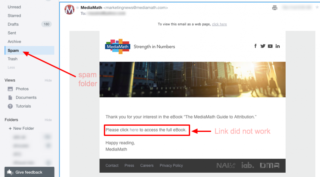
email marketing ineffective spam folder unable link does not work poor testing media match
Time to refresh your LinkedIn profile cover image! Check out some of the best LinkedIn profile cover image ideas, examples and styles
ADMA INVITE EMAIL
Adma! Come on, you should be showing us the best practices!
- Make it personal: add a name in both the greeting and the farewell.
- Add the best Header image, not a random red one.
- Avoid duplication – you have 1 or 2 seconds to grab people’s attention.
- Change the dots for tick symbols ✔︎ or thumbs up ??
- Time it properly. The survey took less than 5 minutes.
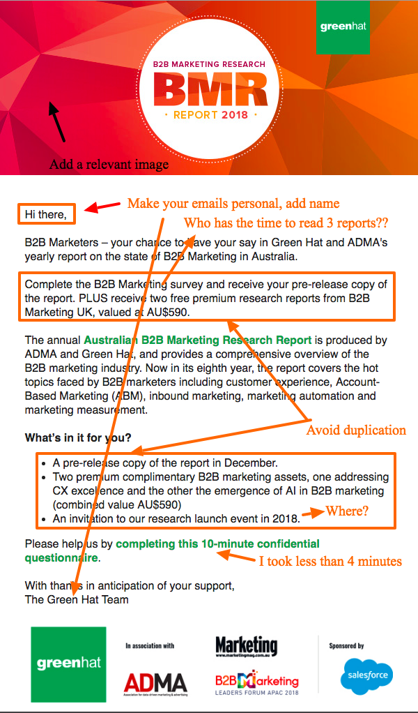
Australian B2B Marketing Research Report Survey email invitation ADMA green hat
“These emails are so dull to check out as to inspire less than favourable comparisons with staple borefest classics like watching paint dry”
Mau
✅ Marketers are using the best bots and apps for free real Instagram followers
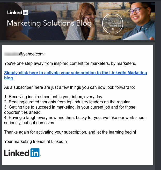
LINKEDIN MARKETING SOLUTIONS BLOG – SUBSCRIPTION CONFIRMATION EMAIL
When email marketing automation forgets about personalisation!
Things Linkedin can improve!
- Make it personal: add a name in both the greeting and the farewell. You are Linkedin you know the names of millions of professionals!
- Modify the numbering for tick symbols ✔︎ or thumbs up
Briefing a professional photographer? The best creative photography brief template
SENSIS AUSTRALIA – BORING SURVEY REMINDER EMAIL
Ouch!
Do you want me to help you
Send me at least a cool email
What a boring email from Sensis
Is your social media working? Write the best social media strategy plan with this premium template
MICHAEL PAGE – THIS NEWSLETTER MADE ME FALL ASLEEP!
This will be a boring job interview! Can someone please go and teach Michael Page’s marketing team about visual marketing? If they are promoting how to make a CV then they should first ensure their e-newsletter are amazing! What a boring execution.
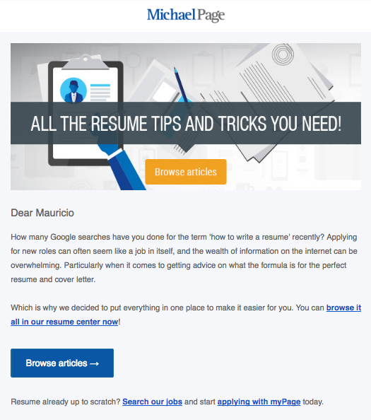
Click on the image to enlarge – Michael Page Sydney Australia email marketing e-newsletter April 2017
Find out the top 25 most expensive art ever sold
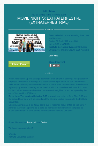
INSTITUTO CERVANTES – THE WORST FONT BACKGROUND COLOUR PAIRING
I need a magnifying glass for this one. Who decided you can read with the below font colour with that background colour? Saying that the below is terrible email marketing execution is a compliment.
TRIPADVISOR EMAIL – POOR COPYWRITING
I am not the best copywriter – surely you will find many copywriting errors in this article – and I got to the point that neither my Spanish nor English are quite good, but hey…this is Tripadvisor! In a world where everyone is busy and has no time, your email marketing communications should include a tangible benefit for your customers to interact with you. In the below example, Tripadvisor’s automated email campaign tries to promote and get users to submit reviews of destinations they have travelled to or visited recently.
What it lacks is to remind the recipient about the benefits of reviewing places.
A customer might ask: “What does it mean if I move to the “next level” or if I get a new “badge”?
This should have been a great opportunity for Tripadvisor to show and explain what the Trip Collective is and why I should be part of it. Probably it would have been nice to show/remind users how many reviews they submitted so far and at what “level” “badge” they are and what the benefits are for interacting.
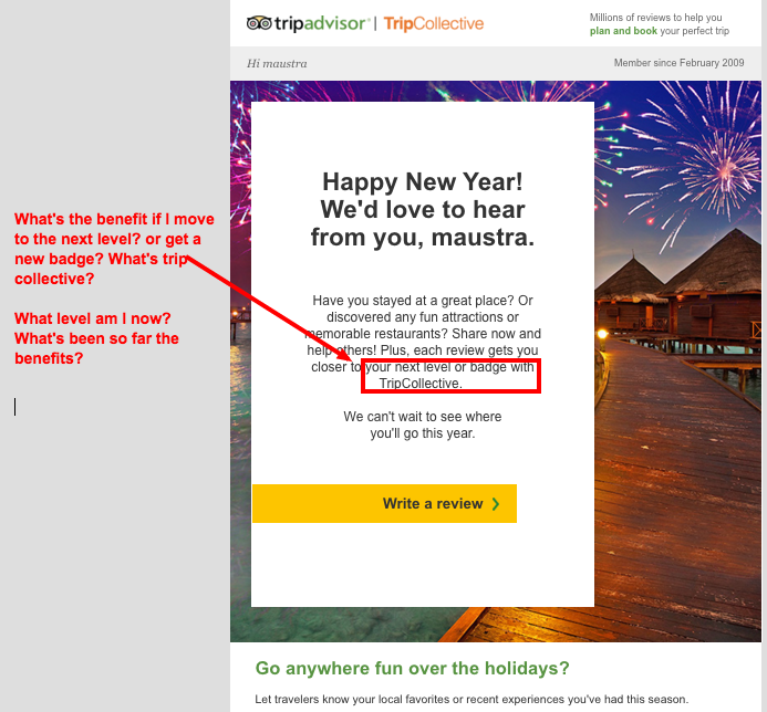
Click on the image to enlarge – Tripadvisor tripcollective review write email marketing poor execution 2016 eDigital
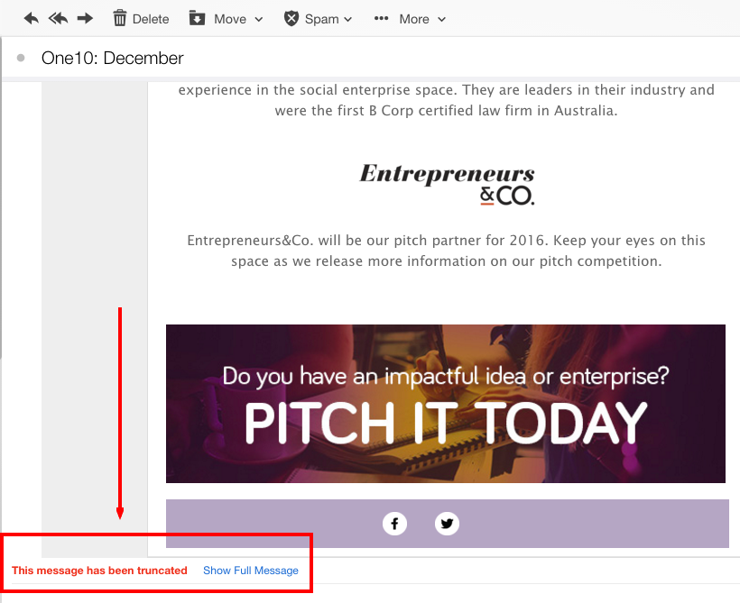
ONE 10 TEAM – FAULTY FORMATTING ENEWSLETTER
Your emails should be less than 102kb. If not, they get truncated/clipped by email providers such as Yahoo, Google or Hotmail.
Join 5k+ subscribers receiving the best digital marketing tips!
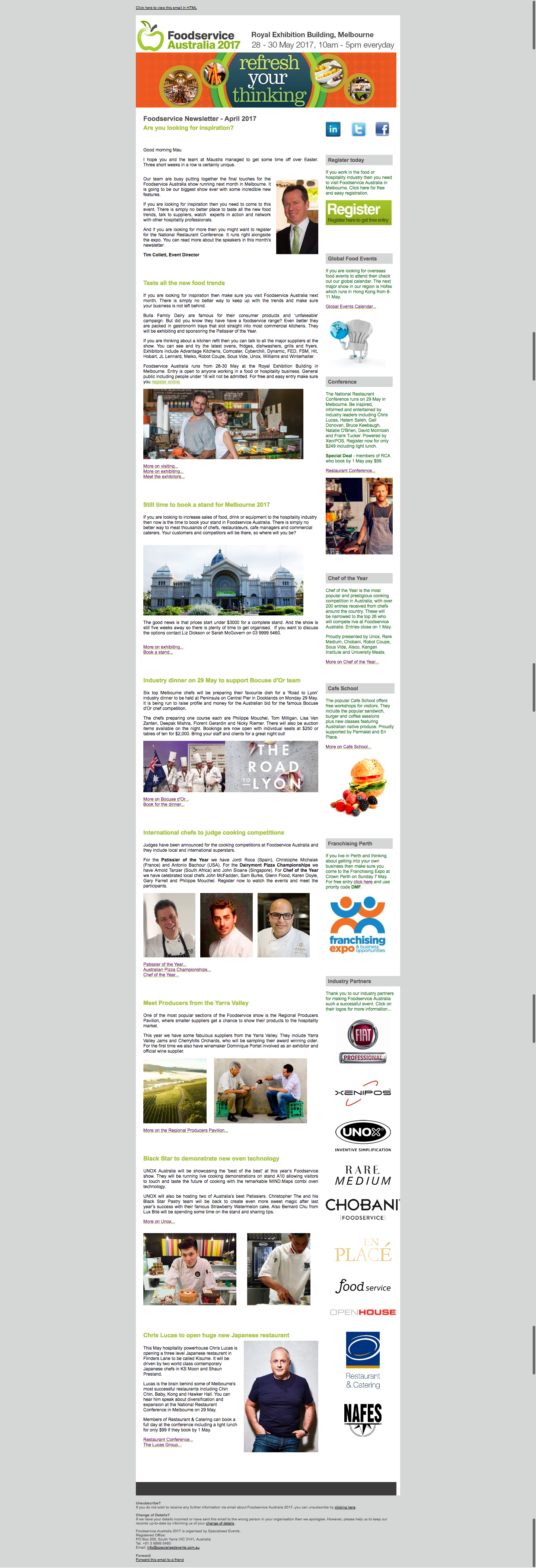
FOOD SERVICE AUSTRALIA – OVERTEXT KILLS IT!
Seriously? Who is going to read all that? I emailed back the “suit and tie” funny gentleman about his opinion but no response yet. Likely he is busy trying to get as much content for his next “stuffy” e-newsletter.
CHECK FOR MISSPELLS
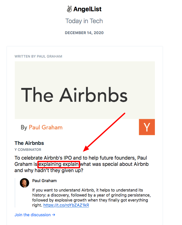
AngelList e-newsletter writing typo grammar mistake error
Even large corporations with massive content teams make grammar mistakes and misspell words. Below is a Shopify e-newsletter and landing page using the word: e-commerce.
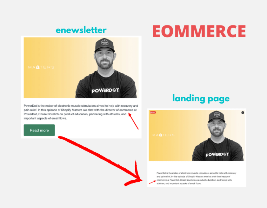
eCommerce misspell grammar mistake – Shopify e-newsletter landing page
KOGAN EMAILS MAKING IT HARD TO UNSUBSCRIBE
In Jan 2021, online retail giant Kogan was fined over $300,000 for repeated violations of Australian spam laws after it sent over 42 million marketing emails from which consumers were unable to easily unsubscribe.

Kogan email campaign fine spam
Marketers are using the best day and time to send out emails.
Conclusion
When people decide to open your email, you only have a couple of seconds to grab your reader’s attention.
This is a proven fact.
If you bombard them with many options, they will feel overwhelmed and decide to delete your email straight away.
You should be testing different content lengths. Images play in email marketing play a big role as long as they are not many and not too large in file size that will slow down the showing of your email.
The first image to appear is key and the creative should create an emotional response with the reader.
eDigital can help you conceptualise, plan, develop, run and optimise successful email marketing campaigns that generate leads and sales for your brand.
Our digital marketing services include:
- Strategic planning for social media and other digital marketing channels.
- Online advertising: Google Ads Search, Display, Re-marketing and social media ads.
- Training: social media marketing training and digital marketing training.
- SEO strategy, SEO content development and execution.
- Celebrity and influencer marketing campaign strategy.
- Branding. Logo creation, brand development and design of marketing materials.
- Consumer contests/competitions/giveaways.
- Email marketing. Dip sequence design and deployment.
- Conversion rate optimisation. Path to purchase analysis and optimisation.
Contact us today and start boosting your leads and sales.
Marketers are supporting us with their generous donations. Donate today and join 5k+ marketers receiving our e-newsletter.
Final note: Want to reduce customer acquisition costs and dependency on paid media? Our exclusive digital marketing strategy workshops will unmercifully review your marketing, help you build a marketing engine with channels and assets you own, stir your team’s thinking, bring new ideas for new conversion paths and boost customer lifetime value.
POOR EMAIL MARKETING & NEWSLETTERS THAT WENT BAD – EXAMPLES
Considered one of the best marketing consultants in Sydney, Mau offers some of the best digital marketing strategy workshops and best social media training. Mau also loves football, design, music and art. Marketers are using Mau‘s popular Digital Marketing Plan and Social Media Plan templates
Hire Mau for marketing training and join 5k+ marketers receiving Mau‘s e-newsletter
Mau is travelling the 🌎 world. Follow Mau’s stories on YouTube

